top of page
4 MIN READ
Ski Like
a Girl
THE PURPOSE
CONTEXT
OBJECTIVE
Ski Like a Girl is a small business that is focusing on creating a community to inspire more girls to hit the slopes.Through brand ambassadors, ski like a girl supports girls who may not have a chance to experience getting on the mountain.
In my role, I concentrated on revamping Ski Like a Girl's website to enhance community engagement and bolster followers for their brand. This project was particularly meaningful to me, as I deeply admire the community that Ski Like a Girl has cultivated. I see this endeavor as a passion project, driven by my enthusiasm for their mission, and I aspire to collaborate with them in the future as a designer.
DURATION
March 2024 - April 2024
MY ROLE
Digital design, web design, art direction, marketing
TOOLS USED
Figma, Procreate
THE TEAM
Lead designer
HEADERS
Ski Like a Girl is all about bringing a community together and shining a light on women in sports. With an exceptional network of female supporters, I aimed to craft distinctive page headers that reflect this spirit on each page, fostering a sense of empowerment for site visitors.


IDEATING
The existing website provided a solid foundation for site organization and flow. I maintained the user flow from the original site but revamped the aesthetics and organization. Initially, the site lacked a distinct brand identity and a clear mission statement upon first glance. I believed it was crucial to address these aspects in order to align the site more closely with their mission and support the growth of their brand.
ORIGINAL SITE


MID-FIDELITY WIREFRAMES


Developing mid-fidelity wireframes allowed me to sharpen the site's user experience. This step was vital for keeping my ideas structured and avoiding excessive fixation on specifics.
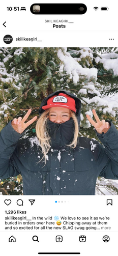
SLAG is a brand that represents a community. I see this as their key attraction, evident in their social media's seamless portrayal of their mission. Throughout my research process, I contemplated: what better approach to elevate the brand than by showcasing those who embody and adore the community?
The content on SLAG's Instagram served as a cornerstone of inspiration for my design concepts.
HOMEPAGE
The existing website provided a solid foundation for site organization and flow. I maintained the user flow from the original site but revamped the aesthetics and organization. Initially, the site lacked a distinct brand identity and a clear mission statement upon first glance. I believed it was crucial to address these aspects in order to align the site more closely with their mission and support the growth of their brand.


OTHER PROJECTS

Saratoga Capital, Inc.
A complete website redesign which aims to focus on the companies multiple sectors in hope to retain existing customers and attract new ones.

Heart of the Valley
A website redesign focused on enhancing visual design and accessibility for its users.

Divvy
Music management system designed to seamlessly share playlists across various steaming services.
bottom of page


